


_
I A R A R Á
C A M I N O A L M A R
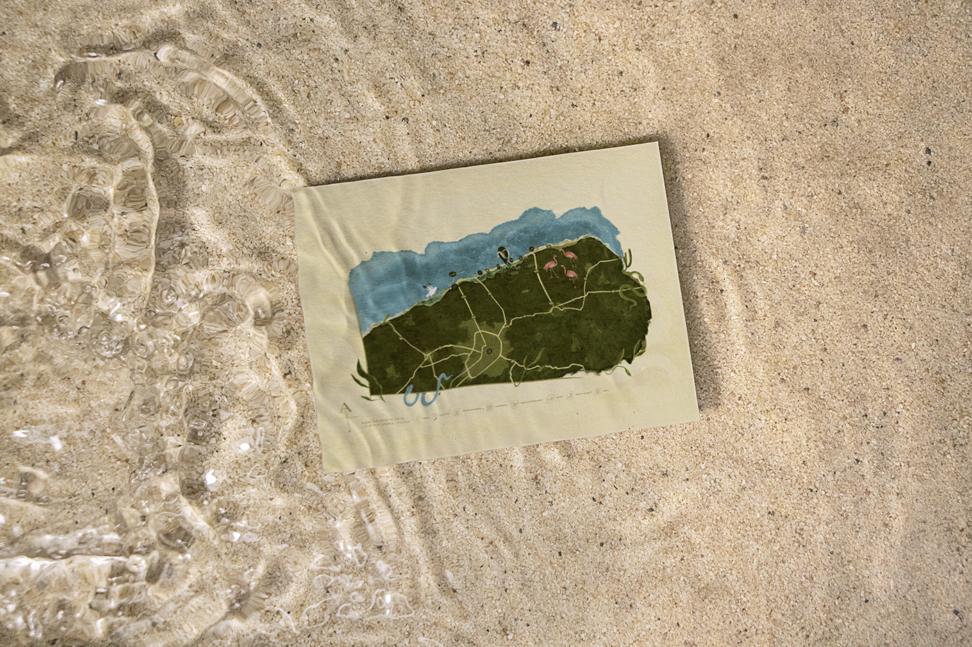
Iarará® is a Mexican contemporary architectural development located in Dzemul, Yucatan, the Mayan peninsula where the sea embraces the jungle and provides an unique territory to be inhabited. This complex consists of five towers placed accordingly to create a winding road to the sea. This placement gave origin to the concept of the name and to the tagline of the brand.
_


_
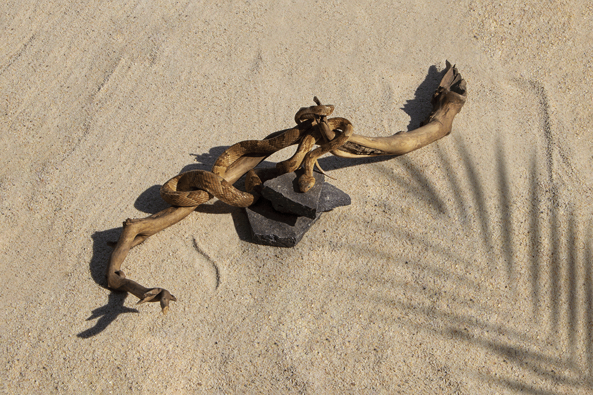
YARARÁCA.
From the amerindian «big snake».
YARARÁCA.
From the amerindian «big snake».
Iarará comes from the amerindian word yararáca which means “big snake”. A snake that slithers through the sand, coming from the jungle, thus creating: a path to the sea. The ophidian represents the fauna of the mayan rainforest. A mighty creature gliding through its territory, representing the luxury real estate development that redefines life in one of the most exquisite locations of the peninsula.
_


Each tower receives a name in the gradient scale of color from the pink
(reference to the pink lagoon a couple of miles from the location) to the teal color of the sea.

We designed the logotypography by creating custom letters to mimic the curves of the snake’s movement and the forms the waves make in the sea. These curves can be appreciated in the “a'' and “r” of the name. Other elements that are part of the brand are integrated, creating a circle around the logo: Puerto Progreso, Yucatan, Mexico, the location, and “a path to the sea” for the tagline.


Additionally, we created a secondary symbol that works great as a stamp, as well as the logo for digital apps. This snake is joined by more illustrations of snakes creating the path to the sea and with the colors of the names of the towers.


